Brand identity

Hocus brand book

This page holds every official Hocus logo version, the colours, typography and usage rules. Always use one of these versions; never build your own variant.

Brand name and mission

hocus.lt

Purpose

Hocus is a next generation car wash and detailing brand built around a franchise based venture studio model. Unlike traditional car washes, Hocus is dedicated exclusively to handmade quality hand wash services, setting a new standard of luxury and craftsmanship in vehicle care. No tunnels, no machines, just pure handcrafted perfection. It is designed to elevate the car wash experience through luxury, exclusivity and a unique brand atmosphere, strategically positioned in major shopping malls and urban centres for maximum visibility.

Target audience

Primary audience

  • Car owners who appreciate high end service, attention to detail and premium care for their vehicles.
  • Entrepreneurs and business owners seeking a low risk, fully supported franchise model in the car care industry.
  • Luxury car owners and enthusiasts who demand pristine maintenance.
  • Shoppers at premium locations like Panorama, Forum, Ozas and high traffic urban centres.

Secondary audience

  • Eco conscious drivers looking for sustainable and water efficient washing solutions.
  • Urban professionals who prioritise convenience and efficiency.

Demographics

  • Age: 25 to 55
  • Income level: medium to high
  • Locations: high traffic urban areas, strategic suburban spots and major shopping malls in Vilnius

Our mission is to redefine car washing

  • Luxury and convenience: Seamless, high end service that merges technology with elegance.
  • Strategic visibility: Six prime locations in major shopping malls, Panorama, Forum, Ozas, and more around the city for maximum exposure.
  • Franchise driven expansion: A venture studio model where franchisees are empowered to operate their locations with full backend support, while SEAL Group UAB handles technology, branding and operations.
  • Handmade quality: No machines, no tunnels, only expert hand wash services that guarantee perfection and attention to detail.
  • Operational simplicity for franchisees: Hocus handles branding, technology, marketing, payroll and even POS systems. Franchisees simply manage day to day operations and local staff.
  • Sustainability: Eco friendly washing processes, minimising water usage and chemical impact.

Two Hocus sub-brands

Hocus runs two equal but distinct sub-brands. The colour signals the location type and price level, so choosing a colour is never decorative.

Hocus Purple, premium

Premium car care centers in prime places: shopping malls and prestige locations. Highest service level, premium pricing, a luxurious and mysterious tone. Use the purple logo, purple mark and purple accent across everything for these locations.

#5624A6 · #642DBD

Hocus Orange, value

Locations outside shopping malls, built around speed, visibility and sharper pricing. Energetic, bold tone. Use the orange logo, orange mark and orange accent, consistently across the whole location.

#F63E00

Rules

  • One colour per location. Never mix purple and orange in one lockup or on one object.
  • Corporate communication (company documents, invoices, job ads) always uses Hocus Purple.
  • Orange locations never use premium vocabulary (“premium”, “luxury”) in pricing communication.
  • The mark always comes from the same colour family as the logo.

Platform emoji

Where a text field cannot carry a logo, one emoji stands for Hocus. The same symbol is used in the app, in SMS and in social bios, so the mark and the words always read as one brand.

Brand emoji

The sparkle from the mark. It opens every bio, every booking confirmation and every post title: once, followed by a space.

🚗

Service emoji

The car emoji is operational only: appointment reminders, “your car is ready” statuses and internal notifications.

  • One brand emoji per line. Never chain them.
  • The emoji supports the wordmark; it never replaces the mark or the logo.
  • Never invent new Hocus emoji combinations (✦🚗✨), it dilutes recognition.
  • No emoji in contracts, invoices or official documents.

Examples

The mark

The mark is the hand-wash motion, one continuous wave closing into a circle, plus the sparkle that marks the moment a car looks new again. It is the most recognisable Hocus element: it works without words, at the smallest sizes and in a single colour.

Simplified mark

Below 24px, or when engraving, use the version without the sparkle. The wave stays recognisable even as a stamp.

Mark · purple

Mark · orange

Mark · white

Mark · simplified

Simplified mark

16px
20px
24px
32px
16px
20px
24px
32px

Simplified · purple

Simplified · orange

Simplified · white

Simplified · black

The mark on backgrounds

The mark has to survive every surface we use. Eight backgrounds, one clear verdict each. If a background is not listed, pick the version with the highest contrast.

Approved

Light grey #F4F4F4

The default surface on web and in documents. Use the coloured mark.

Approved

White #FFFFFF

Print and invoices. Purple or black mark.

Approved

Black #0B0B0B

Premium communication. Use the white or sub-brand version.

Approved

Hocus Purple

White mark only. Purple on purple is never allowed.

Approved

Hocus Orange

White mark; black is allowed in single-ink print.

With care

Light photo

Only with a light overlay, or use the single-colour black version.

With care

Dark photo

Allowed with a dark gradient beneath the mark; use the white version.

Never

Busy photo

The mark disappears. Create a calm area first or move the mark elsewhere.

Construction

  • The mark is drawn on a 104 × 110 grid; the wave is one continuous shape with no added outline.
  • The sparkle always sits top right, its position never changes.
  • The optical centre is the circle of the wave, not the geometric centre of the square.
  • The simplified version drops the sparkle and is used for embroidery, engraving, vinyl and anything below 24px.

Avatars & profile pictures

An avatar is always a square with the mark centred, platforms crop it to a circle themselves. A lockup is never a profile picture: the wordmark becomes unreadable in a small circle.

Avatar · light

The default profile picture. Purple mark on white.

InstagramFacebookLinkedIn

Avatar · dark

White mark on black, for dark channels and dark themes.

YouTubeTikTokDiscord

Avatar · purple

White mark on a purple plate, for premium locations.

Google BusinessWhatsApp

Avatar · orange

White mark on orange, Hocus Orange locations only.

Location profiles

Avatar · gradient

Campaign avatar with the brand gradient. Not for favicons or 24px placements.

CampaignsPaid social

Simplified avatars

Below roughly 32px the sparkle turns into a smudge. Use the simplified mark without the sparkle for those placements: the shape stays recognisable even at 24px.

Simplified · light

Purple mark without the sparkle on white. The default for favicons and small plates.

FaviconMapsSignatures

Simplified · dark

White mark without the sparkle on black, for dark interfaces and badges.

App badgeDark theme

Simplified · purple

White mark on a purple plate, for stamps, embroidery and engraving.

StampsEmbroideryEngraving

When to use the simplified version

  • Anything under about 32px: favicons, map pins, notification icons.
  • Materials without half tones: embroidery, engraving, vinyl, embossing.
  • One channel, one version of the mark. Never mix the full and simplified mark in the same profile.
  • Above 32px always go back to the full mark with the sparkle.

Avatar and cover pairing

Pair the light avatar with a dark cover, and the gradient avatar only with a calm black cover. Never place the gradient avatar on a gradient cover.

Rules

  • The file is always square, 1600 × 1600px, with no text.
  • The mark takes about 50% of the avatar height, never bleed it to the edges.
  • Never use a photo, a staff portrait or a car as the profile picture.
  • One avatar per channel; do not swap it seasonally without the brand team.

App icon & favicon

The app icon is the mark on a single-colour plate, no wordmark, no gradient noise, no shadow. The operating system adds the rounding and the shadow itself.

iOS / Android icon

1024 × 1024px, purple plate, white mark, 22.5% corner radius.

Maskable icon

The mark stays inside the 80% safe zone so Android masking never clips it.

Favicon 64px

Simplified mark without the sparkle, at 16px the sparkle turns into a blob.

Monochrome icon

Black or white mark with no plate: notifications, widgets, printers.

Loyalty cards

The Hocus loyalty system has three formats: a digital card on the phone, a plastic wallet card and a keychain fob. Every tier has its own colour, while structure, typography and mark placement stay identical.

Purple Power Card

Regular customers

The core loyalty card. Deep Hocus purple field, white type and a QR code inside a gradient frame. Used at the wash bays, in campaigns and in bookings.

Digital card

Loyalty Card

Tier

Purple Power

Points

0

First Name

[forename]

Last Name

[surname]

PURPLE POWER CARD

Wallet card
Keychain

Earn rate

1 pts / 1 EUR

Redeem multiplier

1.0x

Free starting balance

5 EUR

Effective cashback

5.0%

  • Background: Hocus purple, solid
  • Type and mark: white
  • Code: QR on white with a gradient frame
  • Fields: tier, first name, license plate

B2B Loyalty Card

Companies and partners

The business tier. Black field, a subtle gold frame and gold typography. Wordmark only, with a QR code carrying the partner number.

Digital card

Loyalty Card

Tier

Business

Points

0

First Name

[forename]

Last Name

[surname]

Company Name

[companyName]

${pid}

B2B LOYALTY CARD

Wallet card
Keychain

Earn rate

1 pts / 1 EUR

Redeem multiplier

1.2x

Free starting balance

50 EUR

Effective cashback

6.0%

  • Background: Hocus black with a subtle gold frame
  • Type and mark: gold
  • Code: QR carrying the partner ID
  • Fields: tier, points, first name, last name, company

Influencer Card

Creators and ambassadors

The creator tier. Bright red field, white wordmark and a QR code. Used for collaborations and campaigns.

Digital card

Loyalty Card

Tier

Influencer

Points

0

First Name

[forename]

Last Name

[surname]

INFLUENCER CARD

Wallet card
Keychain

Earn rate

1 pts / 1 EUR

Redeem multiplier

1.5x

Free starting balance

25 EUR

Effective cashback

7.5%

  • Background: Hocus red, solid
  • Type and mark: white
  • Code: QR on a white field
  • Fields: tier, points, first name, last name

Employee Card

Hocus team members

The team tier. White field, dark wordmark and a purple accent. Carries a fixed 20 percent discount on all services.

Digital card

Loyalty Card

Tier

Employee

Points

0

First Name

[forename]

Last Name

[surname]

EMPLOYEE CARD

Wallet card
Keychain

Earn rate

1 pts / 1 EUR

Redeem multiplier

1.5x

Free starting balance

0 EUR

Effective cashback

7.5%

Discount on all services

20%

  • Background: white with a purple accent
  • Type and mark: dark
  • Code: QR on a white field
  • Fields: tier, points, first name, last name

How the loyalty program works

Earn rate

Points earned per 1 EUR spent

1

Redeem rate

Points needed for 1 EUR credit

20

Example: customer spends 100 EUR

Spent

100 EUR

Points earned

100 pts

Credit value

5.00 EUR

Effective cashback

5.0%

Base rate: 1 point per 1 EUR spent, 20 points equal 1 EUR of credit. Each tier applies its own redeem multiplier, so the effective cashback differs per card. Points are collected automatically in Hocus One.

Card rules

  • The mark always sits top left with the name Hocus next to it.
  • The card heading is always Loyalty Card and is never translated.
  • The QR code always sits on a white field so scanning stays reliable.
  • Tier names are set in bold, points align to the right.
  • The plastic card and the keychain reuse the background of their digital tier.
  • No photography on a card, only the logo on a clean field.

Next tiers

  • VIP card, gold on black

Colours

Primary colour, premium

Hocus Purple

A rich, luxurious tone symbolizing exclusivity, mystery and craftsmanship. It reflects the premium, handmade promise at the heart of Hocus.

HEX
#5624A6
RGB
86, 36, 166
CMYK
48%, 78%, 0%, 35%

Primary red-orange

Hocus Red

A vibrant, energetic orange-red that stands for boldness, visibility and action. Ideal for dynamic locations and audiences who value performance and instant impact.

HEX
#F63E00
RGB
246, 62, 0
CMYK
0%, 75%, 100%, 4%

Primary neutral

Dark Neutral

A deep, premium black that complements both the purple and red-orange palettes while keeping the mysterious, luxurious feel.

HEX
#0B0B0B
RGB
11, 11, 11
CMYK
0%, 0%, 0%, 96%

Secondary colour

Hocus Light Grey

A soft, clean white-grey used for backgrounds and layout balance. It brings elegance and clarity without the harshness of pure white.

HEX
#F4F4F4
RGB
244, 244, 244
CMYK
0%, 0%, 0%, 4%

Semantic tokens

The interface references tokens; print and merch use the HEX and CMYK values in this table. Never hardcode a colour into a component.

TokenHEXRGBCMYKUse
--primary#5624A686, 36, 16648 / 78 / 0 / 35Primary buttons, links, premium accents.
--primary-logo#642DBD100, 45, 18947 / 76 / 0 / 26Logo purple, the mark and the logo only.
--accent#F63E00246, 62, 00 / 75 / 100 / 4Hocus Orange locations, promotions, attention points.
--foreground#0B0B0B11, 11, 110 / 0 / 0 / 96Text and dark brand surfaces.
--muted-foreground#6B6B6B107, 107, 1070 / 0 / 0 / 58Secondary text, never for prices or terms.
--background#F4F4F4244, 244, 2440 / 0 / 0 / 4Page canvas and light blocks.
--card#FFFFFF255, 255, 2550 / 0 / 0 / 0Cards, forms, tables.

Contrast pairings

  • Purple / white, AA at all sizes.
  • Orange / black, AA from 18px; on white use large text only.
  • Black / light grey, AAA, the default text pairing.
  • Secondary grey text, from 14px only, and never for a price or legal copy.

Typography

Hocus uses Outfit, a geometric sans whose round shapes echo the wave in the mark. Headlines are Outfit ExtraBold with tight tracking; body copy is Outfit Regular.

Aa

Švaros centrai, kurie daro stebuklus

Outfit Regular · abcdefghijklmnopqrstuvwxyz · ABCDEFGHIJKLMNOPQRSTUVWXYZ · 0123456789

Outfit Regular 400Outfit SemiBold 600Outfit ExtraBold 800

Typeface

Download Outfit and use it in every document and presentation.

Type scale

Display XLtext-6xl font-black tracking-tight

Clean you can feel

Display Ltext-4xl font-black tracking-tight

By hand. Every time.

Headingtext-2xl font-bold tracking-tight

Premium care in Vilnius

Body Ltext-base

Every car is washed by hand, without brushes and without rushing.

Bodytext-sm

Book online, your confirmation arrives immediately.

Captiontext-xs text-muted-foreground

Prices incl. VAT · duration depends on vehicle size

Labeltext-[11px] font-semibold uppercase tracking-[0.18em]

PREMIUM LOCATION

What to install

  • Outfit Regular 400, body copy.
  • Outfit SemiBold 600, buttons and labels.
  • Outfit ExtraBold 800, headlines and the wordmark.
  • Exported SVG files carry the wordmark as outlines, no font install needed for print.

03

Tone of voice

The Hocus tone is as much a part of the brand as the logo. From a website headline to an Instagram caption we speak boldly, refined and intentionally mysterious. Our words should feel as handcrafted as our service.

01

Bold

We speak with quiet confidence. Hocus is premium by presence, not by volume. No exclamation marks at the end of a line.

02

Mysterious

Exclusivity is built through intrigue. Less is more: we reveal only what is necessary and leave the rest to anticipation.

03

Refined

Language is clean, modern and grown-up. No slang, no advertising noise. Every word is intentional.

04

Assured

We know our craft and our value. The tone reflects precision and mastery, we never apologise for the price.

05

Minimalist

Short, working phrases instead of long explanations. Silence, spacing and simplicity are part of our voice.

Instead of, use

We're the best hand car wash in the city!

No machines. No noise. Just pure, handcrafted clean.

We offer eco-friendly car washing services.

Luxury meets sustainability.

Our team uses advanced techniques.

Every detail. By hand. By experts.

Fast and affordable car wash.

Effortless luxury. Zero compromise.

We're opening soon!

Something premium is coming. 01.09.

Messaging framework

This framework keeps every text, from the website to outdoor advertising, in one voice and pointed at our two key audiences.

Clarity with confidence

Say more with less. Every word serves a purpose; silence leaves space for curiosity.

Handcrafted sophistication

Speak with poise. No gimmicks, no generic claims, everything must reflect an artisanal standard.

Intrigue & exclusivity

Hocus is not for everyone, and that is the point. Invite, but never over-explain.

Purpose-driven luxury

Always show the difference: by hand, no machines, water-conscious, with a real care benefit.

Audiences

The car owner

Values time, paint condition and order. We talk about the result, paint safety and easy booking, not discounts.

Audiences

The franchise partner

Values the model, the numbers and the support. We talk about the system, training and brand strength, without inflated promises.

Headline & CTA library

  • Book your slot
  • Clean you can feel
  • 100% by hand. Every time.
  • Find Hocus near you
  • Care that protects your paint value

Writing per channel

The same voice runs at different lengths per channel. These rules govern format, never tone.

Website & UI

  • A headline is at most 7 words; the subline is one sentence.
  • Button copy is always a verb: “Book your slot”, never “Learn more”.
  • Prices are shown without “from” when the exact price is known.
  • Error messages are calm and specific, with no chain of apologies.

SEO & AEO

  • Every page has one H1 containing a location or a service.
  • Meta descriptions run to 155 characters, with a benefit and an action.
  • FAQ answers are written as full sentences so they work for voice search.
  • Place names read naturally (“in Vilnius, Ozo st.”), never as keyword stacks.

Social

  • An Instagram caption is at most 2 sentences; a story needs one.
  • Up to 5 hashtags, always including #hocus.
  • Before / after shots always share the same angle and light.
  • Comments are answered within 24 hours in the same calm tone.

Email & documents

  • Signature: name, role, phone, hocusweb.com and the logo as a PNG under 100 KB.
  • One-line subject; the first sentence carries the point.
  • Documents are set in Outfit; invoices use the black logo.
  • Official mail closes with the company details, no emoji.

Photography & icons

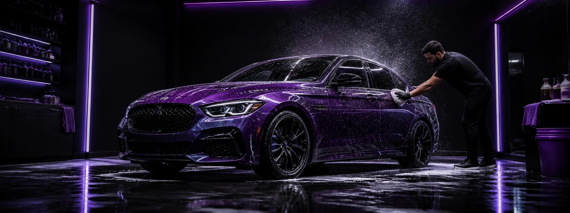
Hocus imagery is dark, high-contrast and close to the work. We show hands, water, reflections and detail, not smiles against a white backdrop.

How we shoot

  • Dark background, one directional light, deep reflections in the paint.
  • Hands at work: microfibre, foam, close-up detail.
  • The car as a form, fragments, not the full side profile.
  • Purple or orange light as an accent, never as a filter.

What we avoid

  • No stock photography with smiling models.
  • No white studio backdrops and no flat light.
  • Never set text over a busy part of the frame.
  • Never recolour the bodywork or add fake sparkle in retouching.

Icon style

  • Outline icons, 1.5px stroke, rounded caps.
  • One colour per icon, brand or foreground.
  • No filled or two-tone icons in the interface.
  • Icon size matches the line height of the text, never larger.

Social images and og:image

Generated images in the brand style. The 1200×630 variant is used as the og:image when a link is shared.

og:image · 1200×630 · Purple

og:image · 1200×630 · Orange

X post · 1600×900 · Purple

X post · 1600×900 · Orange

Instagram / X square · 1080×1080 · Purple

Instagram / X square · 1080×1080 · Orange

Instagram portrait · 1080×1350 · Purple

Instagram portrait · 1080×1350 · Orange

Story / Reels / TikTok · 1080×1920 · Purple

Story / Reels / TikTok · 1080×1920 · Orange

og:image · 1200×630 · Purple · with tagline

og:image · 1200×630 · Orange · with tagline

Social bios

Ready-made copy for profiles. Click to copy.

Recommended sizes

  • Profile picture: 512×512px, mark on a white or black circle.
  • Facebook / LinkedIn cover: 1200×630px.
  • Instagram post: 1080×1080px.
  • X (Twitter) post: 1600×900px.
  • Instagram portrait post: 1080×1350px.
  • Instagram / TikTok story: 1080×1920px.

QR codes

QR codes to hocusweb.com with UTM tagging so print traffic is measurable. Error correction level H, so the mark fits in the centre.

https://hocusweb.com/?utm_source=qr&utm_medium=print&utm_campaign=hocusweb_qr

Hocus Purple

Hocus Orange

Mono

Inverse

Applications

How the brand looks in the real world, in both sub-brands.

hocusweb.com · info@hocus.lt

Business card

Signage

Wash bay

Print & environment

From a business card to a facade sign, same rules, different scale.

Vardas Pavardė · +370 600 00000
hocusweb.com

Business card

A minimal card in purple or orange, heavy stock, matte finish.

  • 85 × 55 mm
  • Logo 28 mm wide, top left
  • Contacts at 7 pt Outfit Regular
  • 350 gsm with soft-touch lamination

No machines. No noise.

Brochure & flyer

Dark background, one strong message at the top, full-width photography.

  • A5 or DL
  • No more than 40 words on the cover
  • Price and QR on the back
  • No gradients on uncoated stock

Signage & banner

Maximum visibility: mark plus wordmark, no extra copy.

  • Logo height ≥ 12% of the sign height
  • Clear space ≥ height of the 'h'
  • Purple in malls, orange on the street
  • Front lighting, no neon outlines

Uniforms & apparel

Black polo, softshell jacket, work trousers and cap, always with the white mark.

  • Polo: 9 cm logo on the left chest
  • Jacket: 6 cm mark high on the back
  • Trousers: no logo
  • Cap: 5 cm simplified mark

Merch & fleet

How the brand looks on vehicles and clothing. The photos are visualisations; the files you download are the real artwork for vinyl and textile printing.

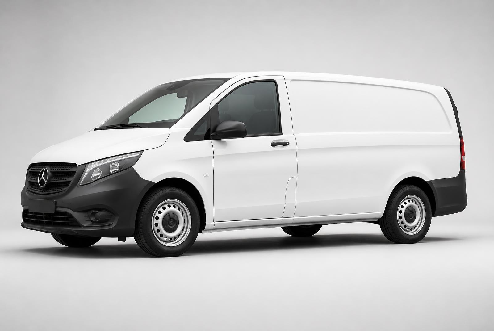
Company van: white eVito

Company van: white eVito

White body, large purple logo on the side and a single thin accent line low on the flank. Orange locations use the orange logo instead.

  • Logo width: 40% of the side panel length, centred on the sliding door.
  • Clear space: at least the height of the logo 'h' from every edge and handle.
  • Apply on a flat surface, never across door gaps or creases.
  • Files: SVG for print, outlined letters, no gradients.

Files for vehicle lettering
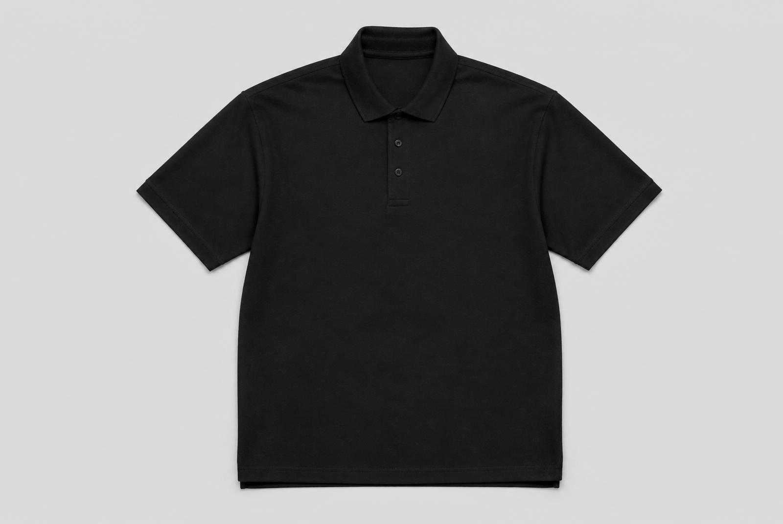
Workwear: black polo

Workwear: black polo

Black piqué polo with the white logo small on the left chest. Calm and professional, used across both sub-brands.

  • Position: left chest, 8 cm below the shoulder seam.
  • Width: 9 cm for embroidery or 10 cm for transfer print.
  • Use the white version only, coloured logos on black are not allowed.
  • Optional 3 cm mark on the sleeve.

Files for textile print (white)

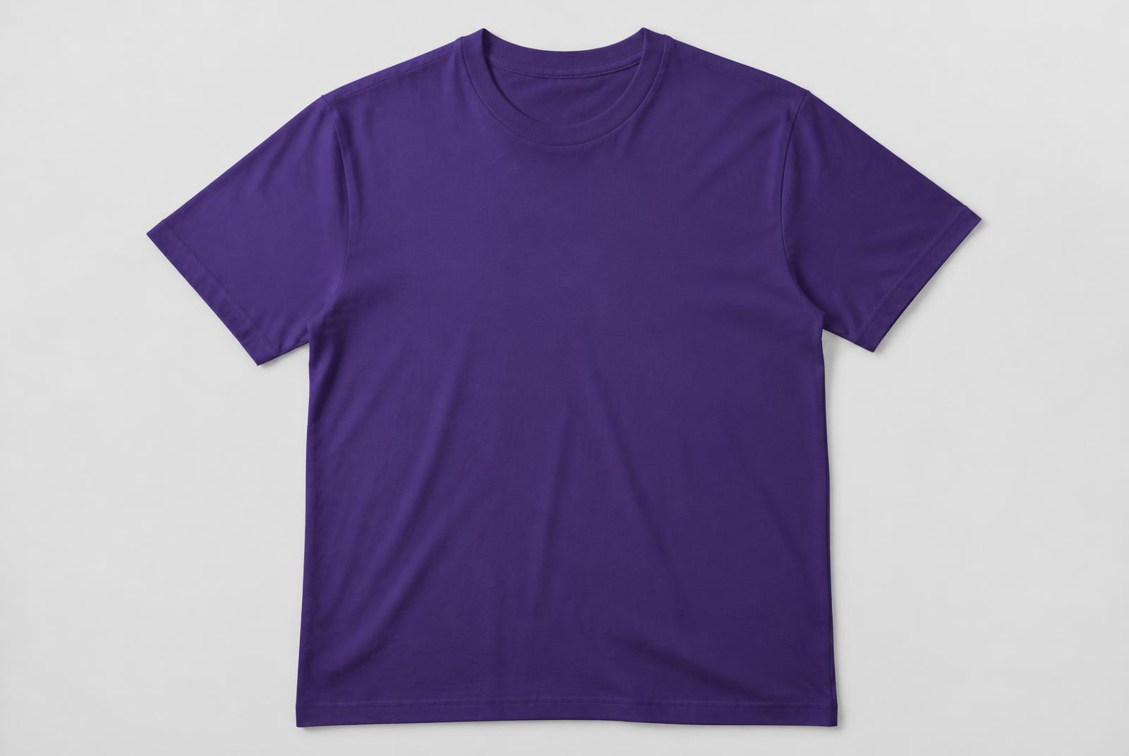
Merch: purple t-shirt

Merch: purple t-shirt

Purple cotton t-shirt with the white logo centred on the chest. For the team and campaigns; orange locations get the orange variant.

  • Position: centred, 7 cm below the collar.
  • Width: 18 - 22 cm depending on the garment size.
  • Print: DTG or screen print in white.
  • On the back, use the mark only, never the full logo.

Files for shirt print (white)

Product packaging: Hocus Bucket Deal

The car care line is sold as one set only, the Hocus Bucket Deal at €129. These shots are both the selling images and the reference for how products are photographed and presented.

Bundle hero shot

Purple rim light, the 20 L bucket centred, products in an arc: use as the main shop image.

Product line-up

Black background, even light, products in rows: use for catalogue and detail views.

€129 · one bundle

  • Label: black block with a purple band top and bottom, white logo at the top.
  • Product name in uppercase under the logo, then 2 - 3 benefit bullets.
  • Background: deep black or purple gradient; never a white studio backdrop.
  • Liquid colour is part of the identity, never recolour it in retouching.
  • The bundle price is always shown as €129; products are not sold separately.

Misuse gallery

The eight most common violations. If you receive a file like this, it is not usable.

Stretched

Proportions changed.

Rotated

The logo is always horizontal.

Recoloured

Colour outside the palette.

Shadowed

No effects or outlines.

On a busy photo

No contrast left.

Mixed sub-brands

Purple and orange together.

Boxed

Never build a container around the logo.

Too close to the edge

Clear space broken.

Writing and Punctuation Rules

Permanent hard rule

Em dashes and en dashes are banned across the entire Hocus website. This rule overrides stylistic preferences, editor habits and any generated copy.

Official policy wording

Em dashes and en dashes are prohibited in all website copy. They must never appear in titles, descriptions, interface text, metadata, accessibility text, marketing content, legal content, or generated text. Rewrite the sentence using standard punctuation or separate sentences. This is a permanent brand rule and applies to all current and future content.
  • Forbidden characters: the em dash and the en dash.
  • The rule covers page titles, headings, paragraphs, buttons, menus, forms, placeholders, validation and error messages, tooltips, modals, banners, notifications, metadata, SEO titles and descriptions, image alt text, ARIA labels, structured data, legal text and cookie notices.
  • Rewrite the sentence naturally. Never swap the character for a hyphen mechanically.
  • Use a comma, a period, a colon, a semicolon, parentheses or a separate sentence instead.
  • The rule applies to all future pages, components and generated text.

When a plain hyphen is allowed

  • Inside a compound word where grammar requires it.
  • In reference numbers, dates, codes and technical identifiers.
  • In URLs, email addresses and phone numbers.

Examples

WrongHOCUS [em dash] car care centres

RightHOCUS: car care centres

WrongBook online [em dash] pick a centre and a time.

RightBook online. Pick a centre and a time that suits you.

WrongWash [en dash] from EUR 20

RightWash from EUR 20

Do / Don't

Do

  • Use the original files from this page.
  • Keep the clear space around the logo.
  • Use the white version on dark backgrounds.
  • Pick the location colour by sub-brand.
  • Before print, check the file is SVG with the letters outlined.
  • Below 24px, switch to the simplified mark.
  • Pick the version with the highest contrast, not your favourite colour.
  • When in doubt, ask the brand team before publishing.

Don't

  • Don't use the purple logo on an orange location, or the other way round.
  • Don't recolour the mark or apply gradients.
  • Don't stretch, rotate, or add shadows and outlines.
  • Don't build new lockups combining the logo with other wordmarks.
  • Never use a screenshot instead of the original file.
  • Never set the logo and an emoji on one line as a single lockup.
  • Never change the tracking or the proportions of the wordmark.
  • Never use 2024 files, everything current lives on this page.